
Tools for Process Evaluations
A few of my favorites

This week, I want to list out some of the tools that I think are very helpful in doing process evaluation. Process evaluation is a very commonly requested type of evaluation in which we are evaluating how something is done rather than the product or outcome. Process evaluations are often concerned with implementation fidelity – how well we implemented the plan – but, more importantly, they are critical for discovering potential improvements. As I explained in my post about CIPP evaluations, when we skip the process evaluation we often don’t have any idea what to recommend as improvements to the program or product. We can’t make it more efficient or effective if we don’t collect and analyze process data, and if we don’t collect our own process data, we just end relying on the client’s opinions as data and telling them what they already know.
So how do we collect good process data? Obviously, the answer to this is going to depend on the nature of the evaluand, but since I am a program evaluator I’m going to tell you some things that have been useful to me. As you read some of these methods, you may be thinking “I don’t have the time/budget/expertise to do this” and that’s ok. When I teach methods, I always make the point that every research methods gives a new way to think about data that transcends the literal procedure involved: for example, you can conceptually “control” for a variable in a qualitative analysis if you understand how statistical controls work. Just getting the conceptual point of some of these methods can improve your thinking and writing about process evaluation even if you can’t use the exact methods I’m talking about.
Layered system maps
System maps represent how processes work within and between organizations. There are many kinds of “system maps”, so I use this as a general term. Let’s think about a few different ways to map a system using the example of a substance abuse treatment program:
Org chart: shows the roles of staff in the program
Flowchart: depicts the step-by-step processes clients go through in the program, from initial referral to discharge
Stock and flow diagram: shows the accumulation of clients in the program and the rate at which they progress through different stages
Value stream map: shows how value (e.g., successful treatment outcomes) flows through the program in steps where value is added (e.g., treatment plans) and where delays or inefficiencies occur (e.g., long intake process)
Business Process Model and Notation (BPMN): standardized diagram showing decision points and parallel processes
Actor-network diagram: shows human and non-human actors in the program and their interactions (e.g., clients interact with counselors via intake forms, and data flows from treatment sessions into a reporting system)
Rich picture: draws a holistic, visual narrative of the program, including messy details, including drawings or symbols for stakeholders (e.g., funding agencies, families, employers), challenges (e.g., stigma, transportation), and dynamics (e.g., collaboration between providers)
And of course, we can layer any of these maps on top of a map of physical space. We need layers because these processes are always too complicated for to be represented as a flat 2-dimensional space. One common mistake I see, even with very well-resourced projects, are system maps that are crammed with detail on a single layer. In the 21st century, we don’t need to confine ourselves to things that can be represented on a single page. If we have to put something onto a page, we can show different combinations of layers depending on the point we are making. For example, if we are trying to show that there is a long waiting list for the program and that this is decreasing the value of the service, we could layer a stock and flow diagram on top of a value stream map.
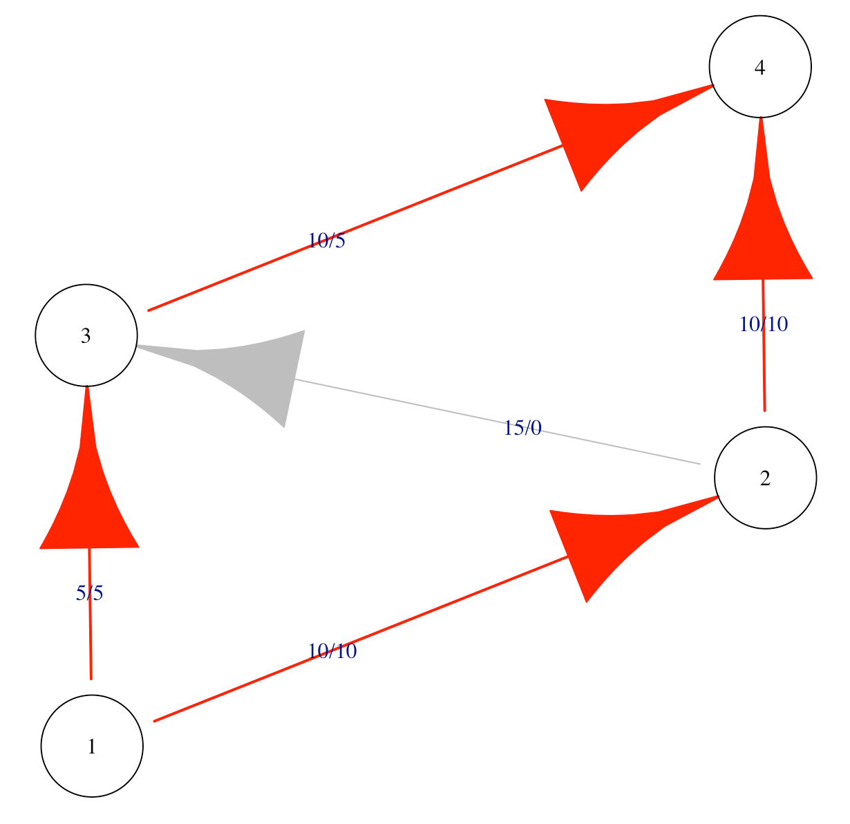
Max-flow min-cut theorem
Once we have a stock and flow diagram showing us the throughput of different parts of a system, we can identify the peak efficiency of that system. The basic math that allows us to do this was created right near my current location in SoCal by Ford and Fulkerson in 1956 and it is known as the max-flow min-cut theorem. The theorem shows that the efficiency of any system is constrained to the maximum flow of the smallest total weight of the edges that connect the start to the end. In other words, if I need to get 10 people to the airport, but the shuttle bus only fits 8 people, then I can only actually get 8 people to the airport. This is also true if I have two cars that can each fit four people and no shuttle bus. This is easy to understand conceptually, but the math to work it out actually didn’t exist until the 20th century, and now we can calculate the maximum flow of very complex networks using software. (Oliver Johnson just posted a lovely introduction to max-flow min-cut on Substack a few days ago.)
Max-flow min-cut is very handy for process evaluation because it helps stakeholders break out of the compensatory, “compliment sandwich” way of thinking about their processes. For example, “we do a good job of recruitment, but are somewhat slow at assessment, but we are efficient at treatment, but we are somewhat slow at referrals to higher levels of care…” Once you show the client the max-flow min-cut they realize that inefficiencies in these process are not a compensatory, good-news-bad-news situation: the efficiency of the entire system is constrained by the process with the slowest throughput. This makes the whole system inefficient. The good parts of the system do not compensate for the bad parts.
Poisson distribution for response times
For systems that provide services to people, we usually want to know whether these services are being provided in a timely fashion or how long it takes certain processes to happen. A classic way of looking at response times is to model expected response times using the Poisson distribution. The distribution is a sideways teardrop with a long right tail. You can think of the distribution as a hypothesis that says that most response times will happen close together near the mean response time but some things will take much longer.
We can set a threshold for unlikely values, for example, as those occurring only 1:1000 times if the Poisson distribution characterized the underlying process by which the data were generated. If certain response times take longer than this, we can call them outliers.
Having a reasonable model of response times in my back pocket gives me a starting point to talk about the program’s ability to get things done. It’s a probabilistic model, not a deterministic one, so it allows for some random variation. Sometimes, it turns out that the first model I show to clients doesn’t look exactly right to them, so we discuss what would be a good model for response times and try to come to rational agreement on that. As program’s get better, we model the desired response times as faster, while remaining responsible to reality in setting our targets.
Simple Simulations
Using the Poisson distribution for response is actually a special case of a more general strategy for doing process evaluations: using simple statistical simulations to model program processes. A simple simulation can combine multiple sources of information into an integrated model that is capable of surprising us. Simulations can be surprising because the combined implications of many small processes are hard to hold at once in our minds. For example, how many successful outcomes should be expect if 20% of participants drop off at during enrollment, 20% of those no-show after their first visit, 15% of those are non-compliant with treatment, and there is only a 60% chance of positive outcomes when participants do comply with treatment? Now imagine that we stop using binary cutoffs, and instead draw each of these options from a continuous probability distribution of possible options? We might find that, even under a very good scenario, only a handful of the people who walk in the door were likely to have a positive treatment outcome conditional on the process.
Once we have a simulation of the process, we can use this to model alternative scenarios. What would happen if we were able to decrease no-shows by 50%? This might actually be the biggest point of leverage for the program, bigger than improving the primary treatment.
Perhaps most importantly, simulations can help us escape the problem of arbitrary criteria. Too often, funders and program staff pick criteria out of hat, like “75% percent of participants will achieve sobriety” without any empirical data because they believe that there is no rational basis for choosing any target in particular (so it might as well sound good). This leads to programs missing targets that are too high and being called failures. I’ve even programs defunded for missing targets that nobody, including the funder, would say were realistic. Simulations, paradoxically, bring our standards closer to reality.
Cognitive Interviews
Cognitive interviews, sometimes called “think aloud interviews” come from the methodological worlds of psychology, assessment, and forensics. In these special interviews, the researcher begins by training to the participant to say out loud all the thoughts that come into their mind while they answer a question or complete a task (concurrent) or just after they complete the task (retrospective). If done correctly, cognitive interview transcripts are some of the messiest, nonlinear qualitative data you will ever see. The transcripts usually look something like this:
Interviewer: OK, now imagine that I just walked in off the street and I’m a total stranger to the clinic. Let’s have a conversation but you say everything that comes into your mind as we do.
Staff: Sure, ok.
Interviewer: Hi, I’m looking to make an appointment.
Staff: OK, so I say ‘Have you seen us before?’ but I’m probably going to know that we haven’t since I recognize just about everybody, so I might just skip that and say, ‘Last name?’. But sometimes people don’t want to give me a name until I tell them whether they can get an appointment because there are two other clinics in town and they might be able to get an appointment faster at the other one and they sort of shop around for an appointment you know? So I sometimes have to have a little conversation and tell them that I might or might not be able to get them an appointment depending on whether they qualify, but of course not everybody knows what that means, some of them don’t even know what kind of insurance they have or we end up signing them up for insurance in the first place, but that can take a long time…
What we learn from cognitive interviews are the actual decisions that staff make in the process of providing services for the program, rather than the official rationalized version. The point of finding the real version is not to try to “catch” people deviating from the official program implementation script, but rather to simply understand the true program design. The differences between the true story and the official version can have major implications for the evaluation. For example, some programs do not officially acknowledge that they are applying implicit screening criteria that means they only see high-needs participants; this can come in the form of an automatic referral process for people with certain diagnoses or who fit the criteria for other programs in the same system. Knowing the true decision-making process of staff is the only way to appropriately contextualize the results of the program.
What are your favorites?
These are currently my favorite tools for process evaluations. I also notice that they are all things I did not learn in my standard social science courses for my PhD. I discovered cognitive interviewing while studying psychometrics, and learned about all the other methods from reading well outside my discipline in areas like simulation and optimization theory. This might be a hasty generalization, but this does make me wonder whether most of us are better prepared for outcomes evaluation than for process evaluation.
So, now you’ve heard about my favorite process evaluation tools. What are yours? Drop some ideas in the comments.